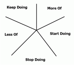
Diagrams are always helpful focal points for starting discussions, and that is one reason I like using the starfish diagram for a retrospective. This particular retrospective technique helps people by getting them to reflect on varying degrees of things that they want to bring up, without having it fit into the black or white category of ‘What Went Well’ or ‘Not So Well’. Hence, I think it scales a little bit better.
Keep Doing – This is a good starting point for team members to focus on typ ically all the good things they liked about a project. You might want to encourage people to think about what they would miss if they did not have a particular practice, technique, technology, person, role, etc. An excellent example from an actual session I’ve been in before is ‘Running performance benchmarking and tuning during an iteration helps identify regressions or slowdowns so we can address them earlier’.
Less Of – Helps to focus on practices that might need a bit more refining or were simply not helpful in the current circumstance. Perhaps they add value but not as much as other practices could. An example here is that perhaps stand-ups have become status meetings, so there should be less talking to one person (and more talking to each other) during them.
More Of – This is another type of focus that helps further refine or highlight practices, technologies, etc., that team members might want to try more and are not necessarily taking full advantage of. A good example is that maybe the Team are using pair programming, but knowledge transfer and a better understanding of the code changing might be gained by swapping programming partners.
Stop Doing – Obviously for things that are not very helpful to development practices or not adding much value. Perhaps it is about writing that status reporting email at the end of the day (because you can substitute a simple one-minute conversation for it instead)
Start Doing – This is a great opportunity for team members to suggest new things to try because of things that may not have gone so well or just for simply keeping things dynamic and fun. Perhaps you might want to try a burn-up chart on the whiteboard or try some new open-source tool for helping improve developer productivity.
Interpreting the Starfish
Getting people to either write things up under the starfish in this manner gives you a scattergram of sorts and is a great visual technique of estimating the overall health of your project. Most of the points on the starfish also try to coerce people into actually creating action items instead of simply saying that something was not good.
